
Sarah Bernardo
Graphic Design + Creative Services + Trend Forecasting
New York-based creative with over a decade of experience translating trends and insights into design that moves people and culture.


Future Snoops
Trend Forecasting & Creative Futures Agency
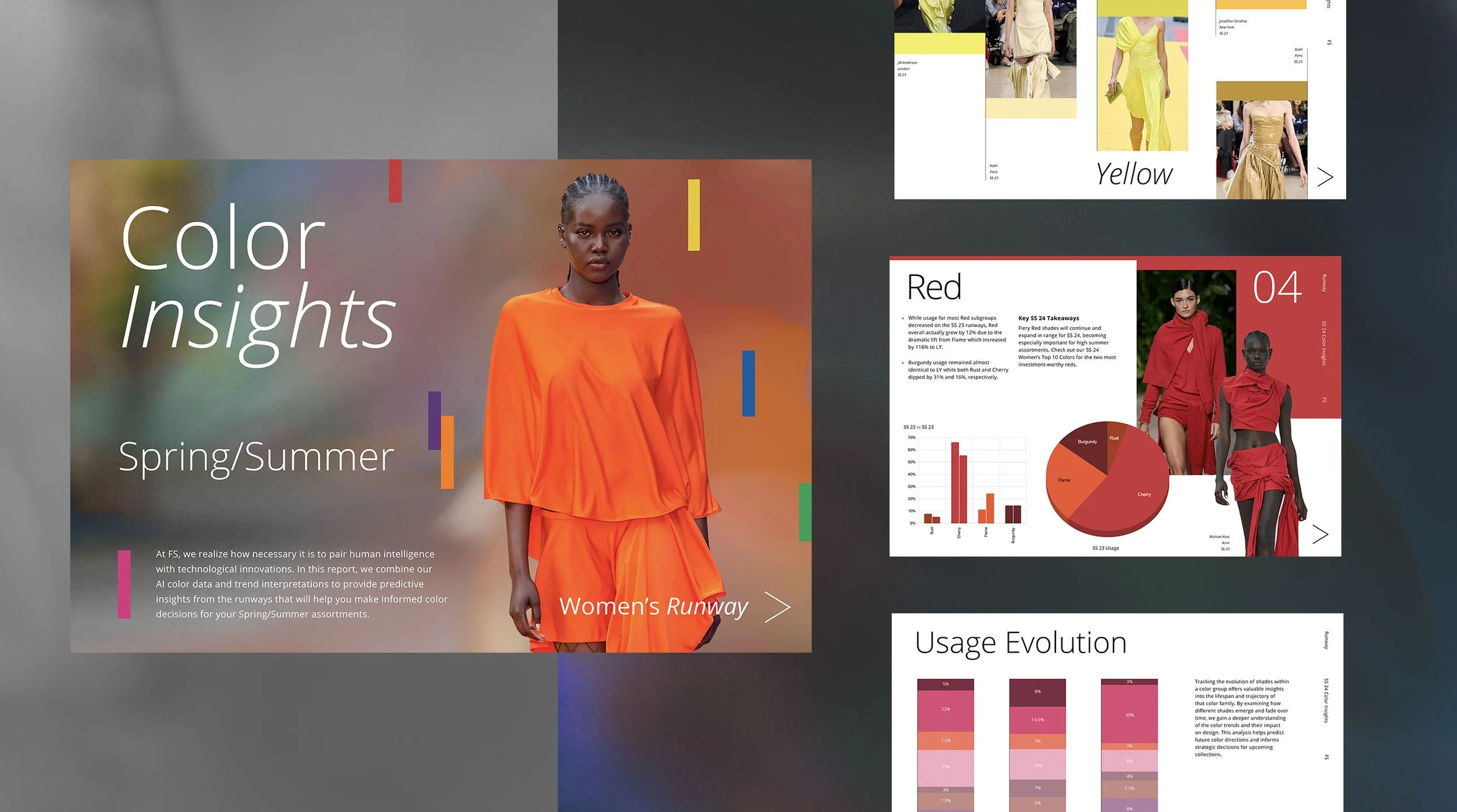
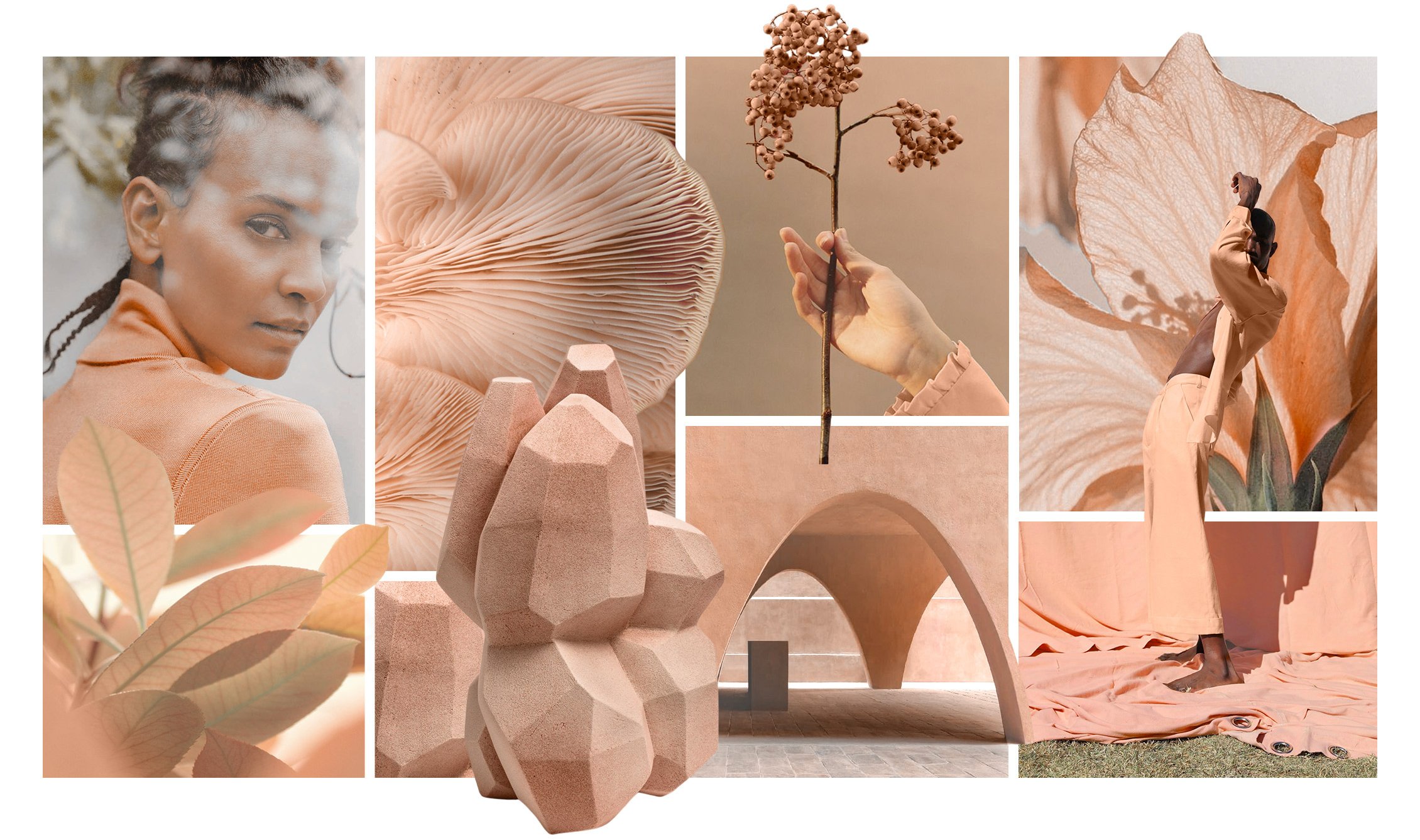
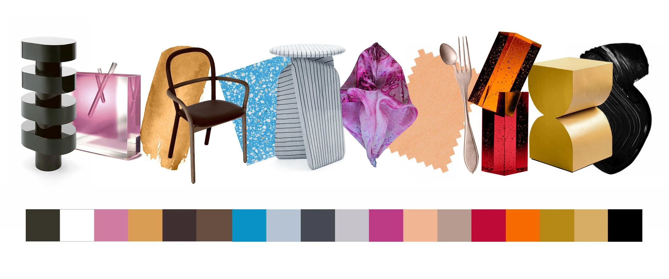
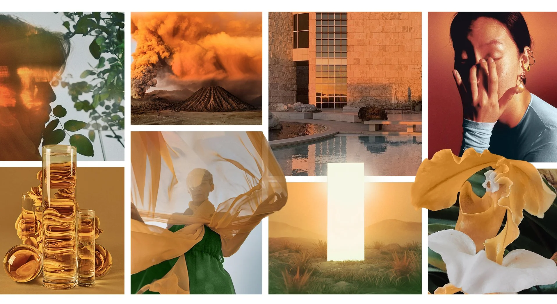
Trend forecasting meets design at Future Snoops, a creative futures agency serving clients across fashion, home, beauty, and kids. I contributed to seasonal trend research and led the visual translation of trend concepts into editorial layouts spanning digital reports, event presentations, and client-facing deliverables. The work required equal parts cultural intuition and design systems thinking: building a library of hundreds of original templates that maintained the agency's visual language while giving each trend story its own identity. Clients used this work to inform product development, buying, merchandising, and brand direction.

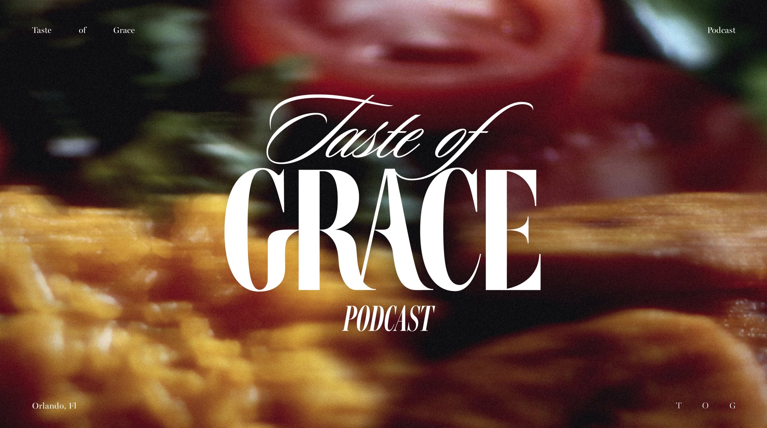

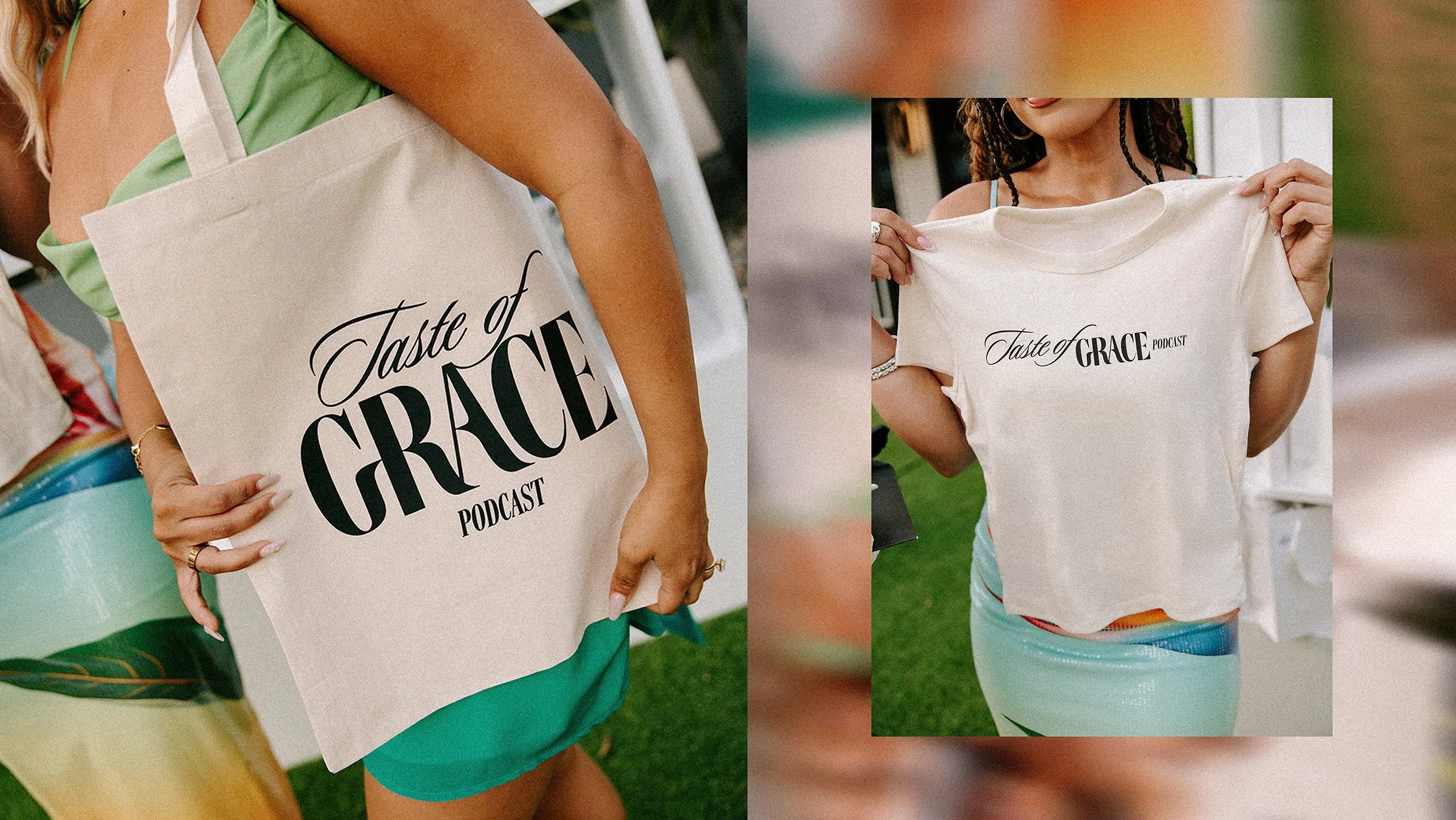

Taste of Grace
Podcast
The team at Taste of Grace requested a logo that exudes a modern, sleek aesthetic while maintaining a subtle edge. To achieve this, the design process involved blending traditional serif and script typefaces while carefully integrating custom details. The aim was to combine the timeless elegance of serif fonts with the fluidity of script. This fusion of elements resulted in a final design that feels timeless while capturing the desired modernity and edge.

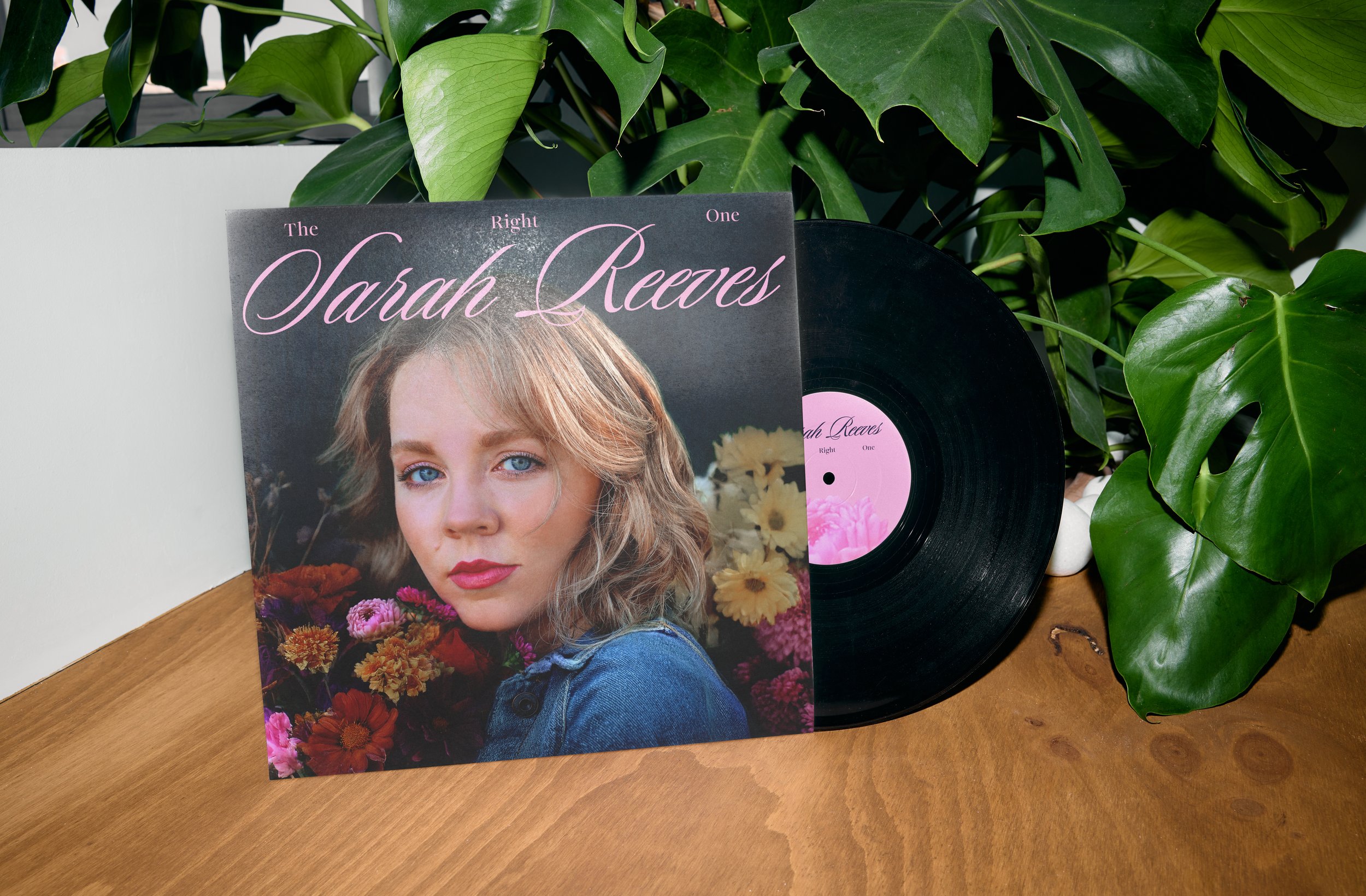
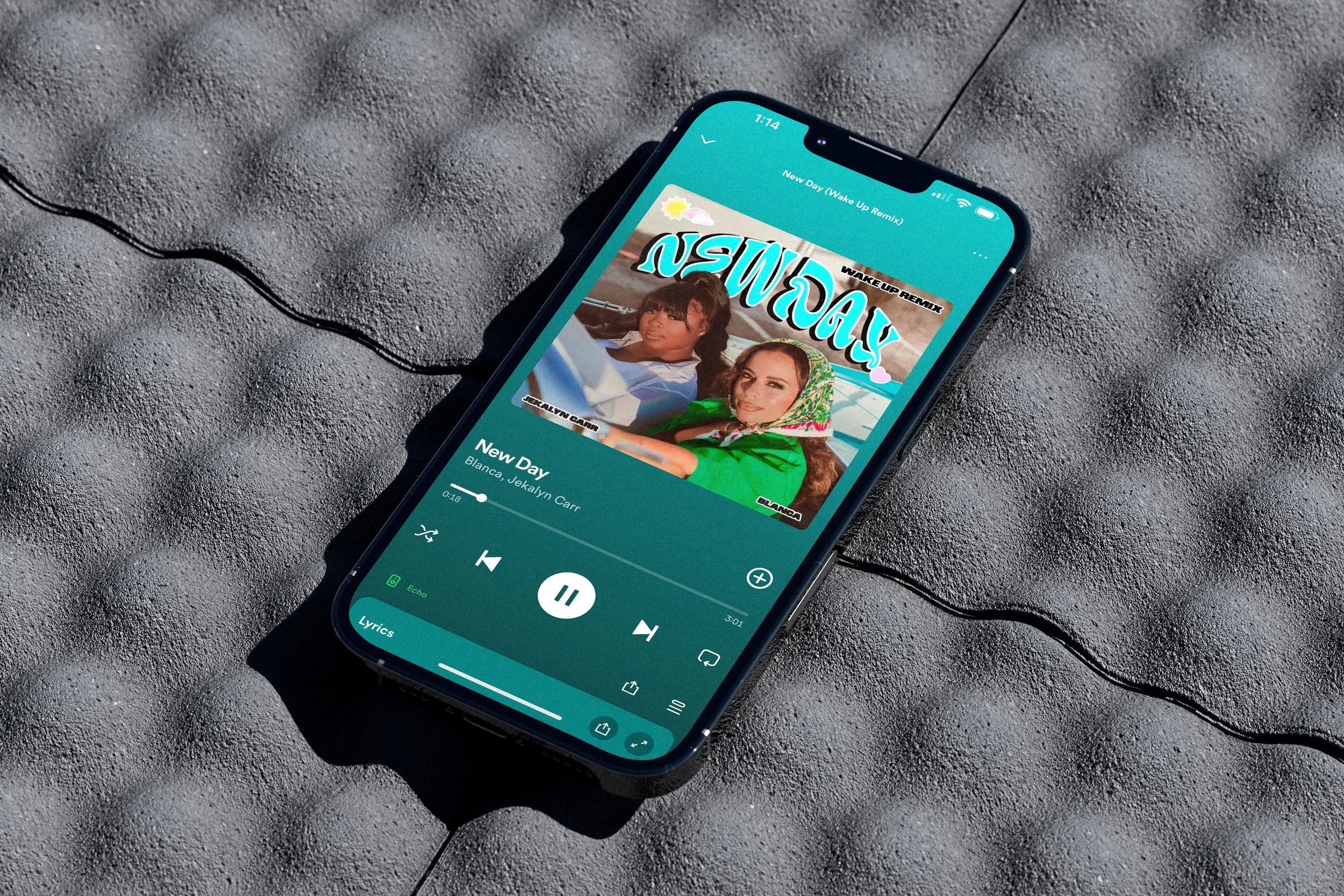

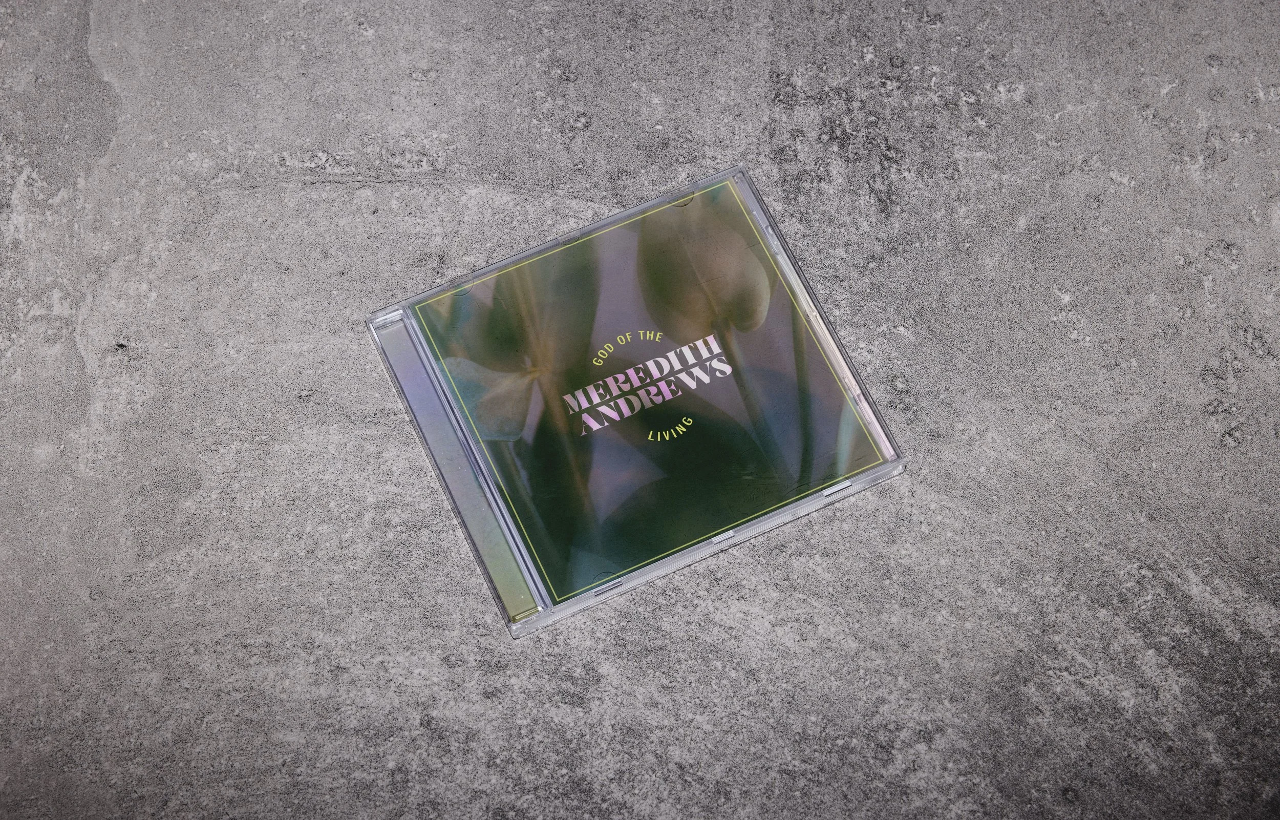

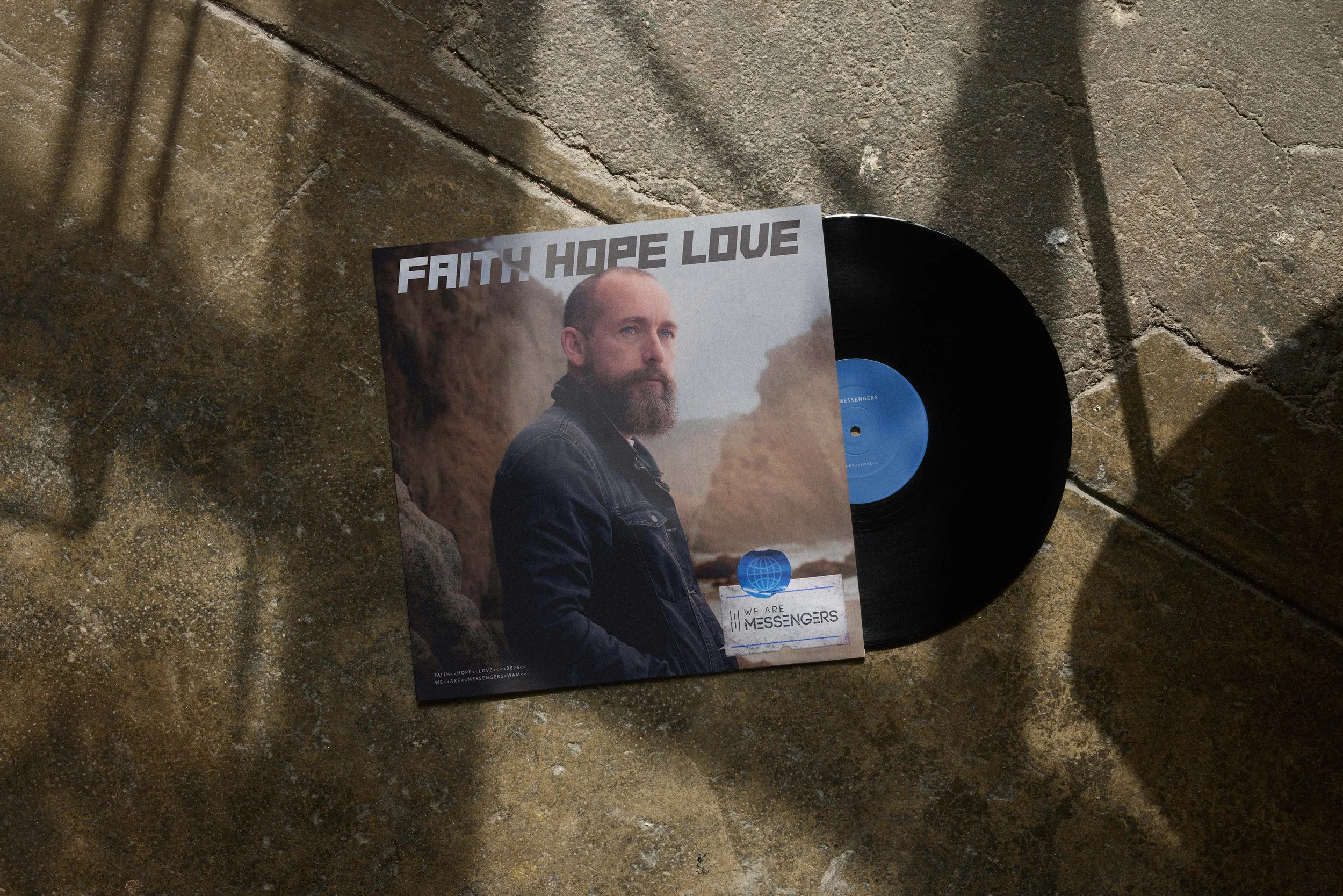
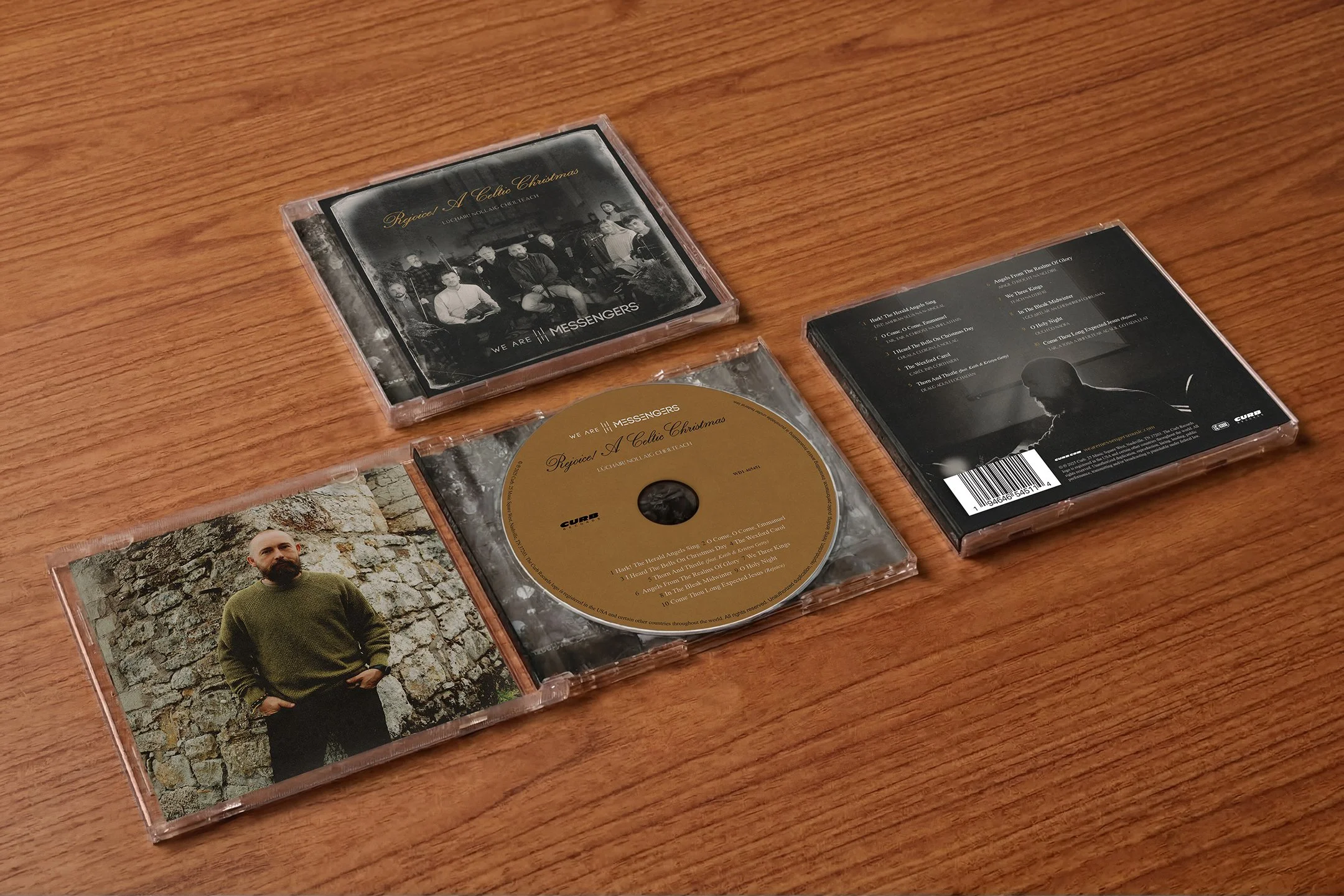
Curb
Independent Record Label
Music packaging is one of the few places where a single image has to carry an entire world. Working alongside the Curb Creative team since 2017, I've designed digital single covers and album packaging for artists across the label's roster, each one a translation of sound into visual identity. The challenge is always the same: make something that feels undeniably like the artist, while giving it a life of its own.
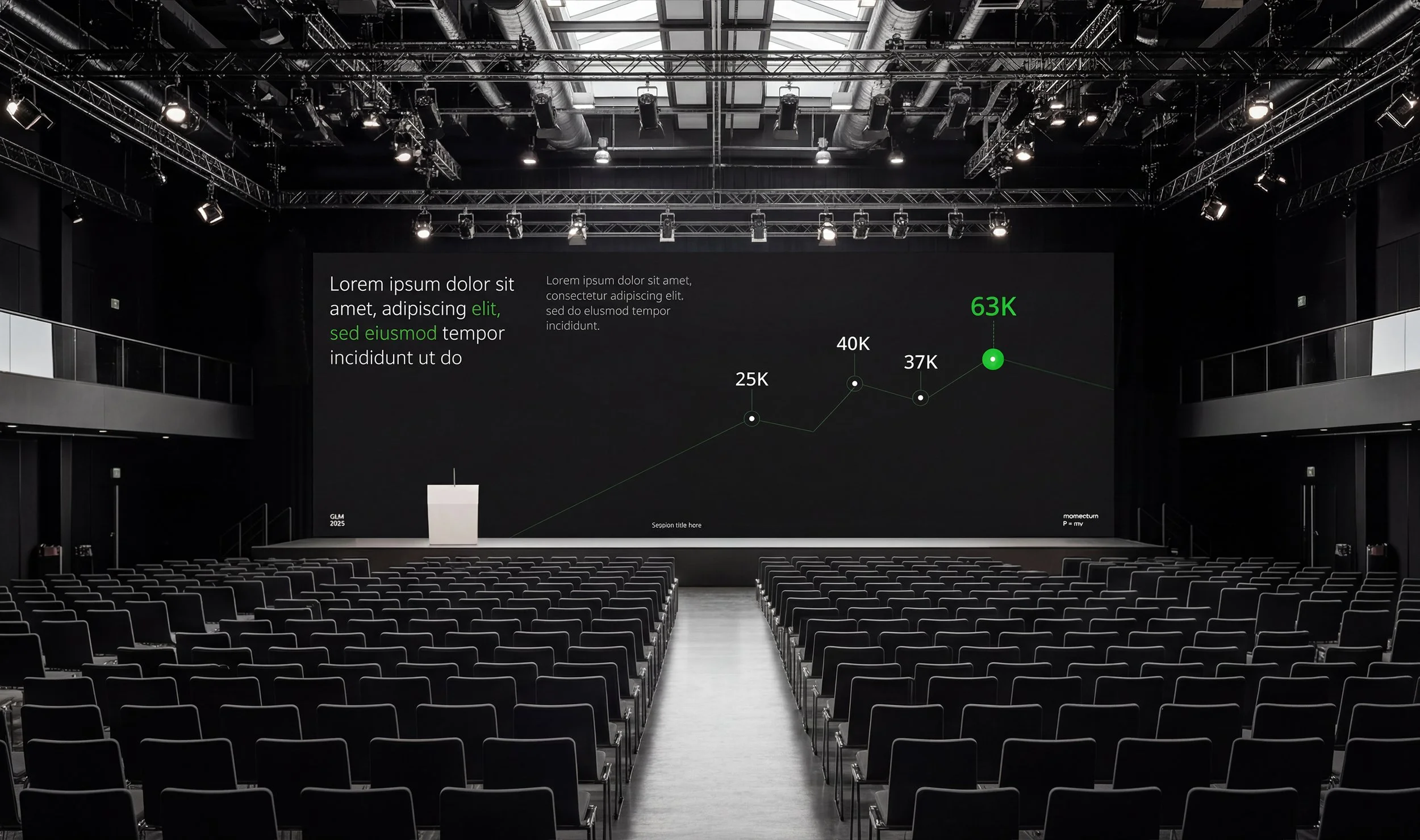
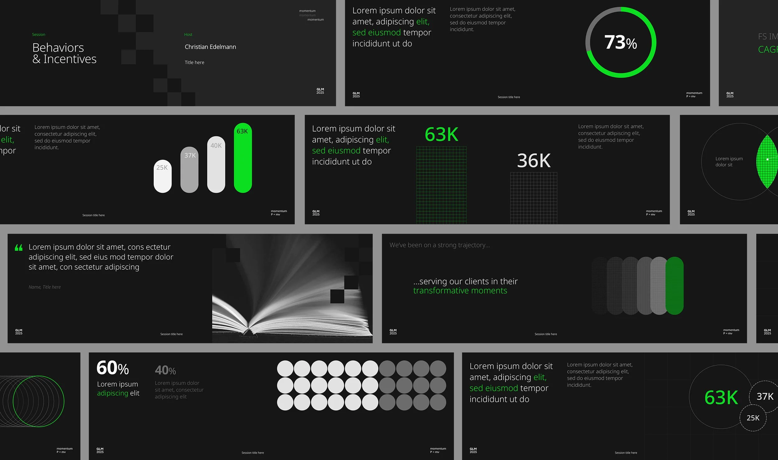
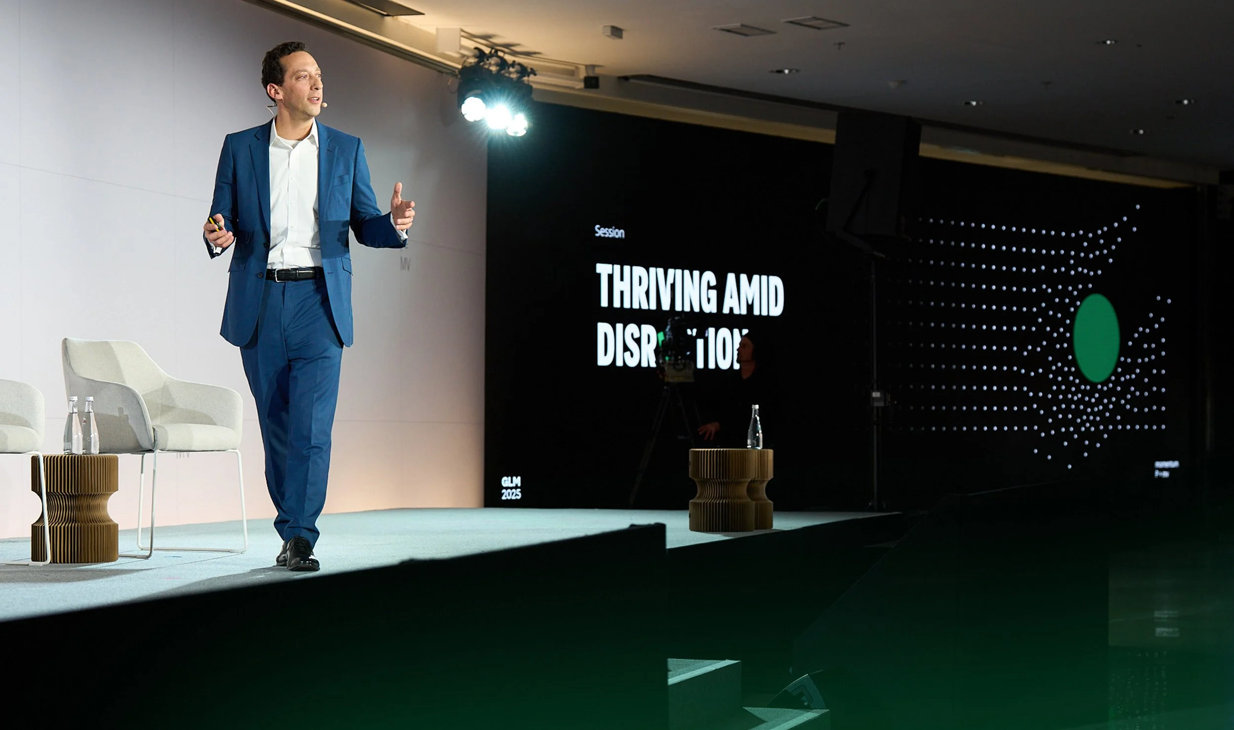
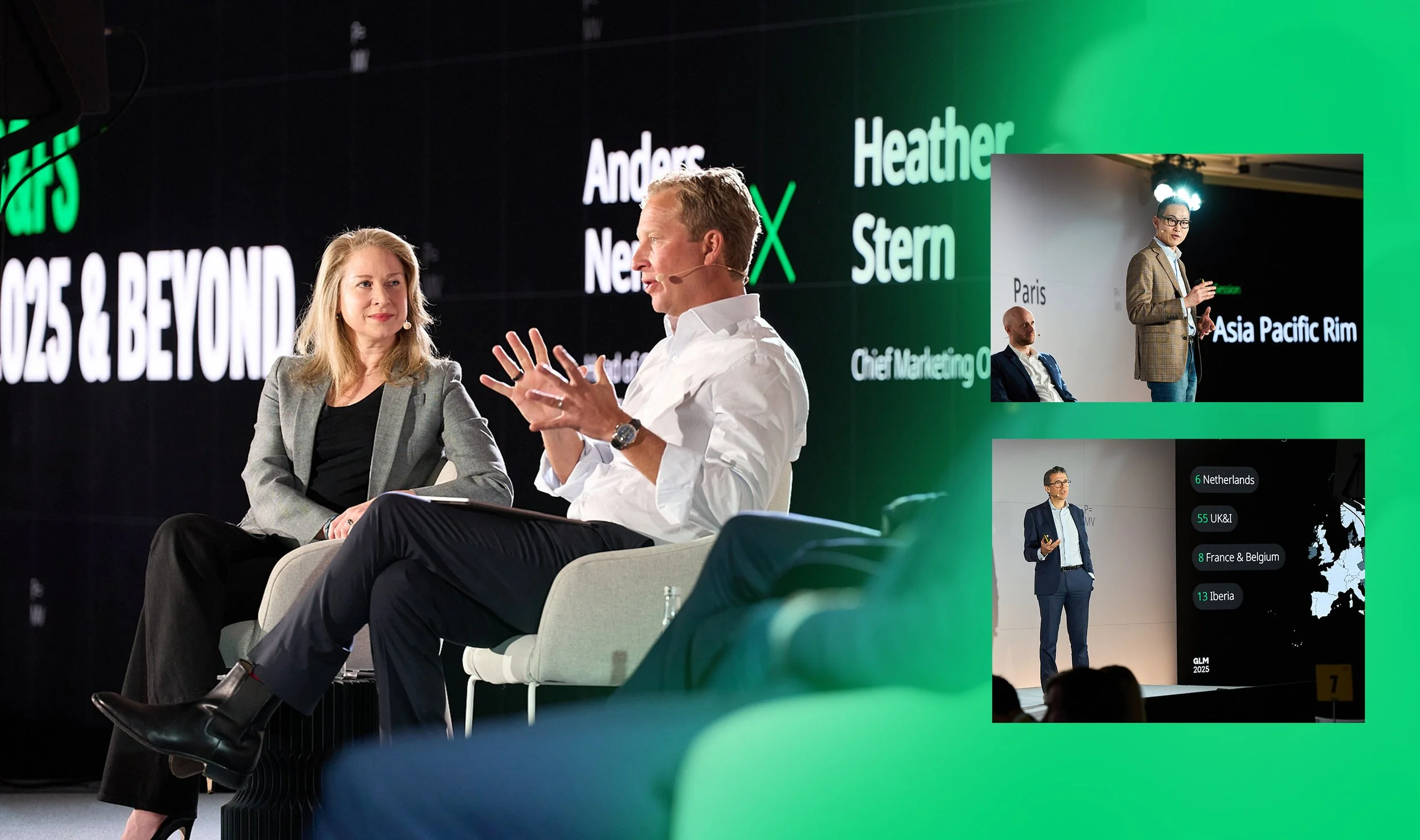
Global Leadership Forum
Oliver Wyman
For Oliver Wyman's Bi-Annual Global Leadership Meeting in Paris, I developed a master slide template and adapted it across multiple sessions, creating a unified visual system that still gave each team room to tell their own story.
The design work centered on typographic hierarchy, intentional layout, and selective use of AI-generated imagery to reinforce each narrative. Content was designed around a dual-screen configuration, with animation applied to add rhythm and keep audiences engaged across long sessions.


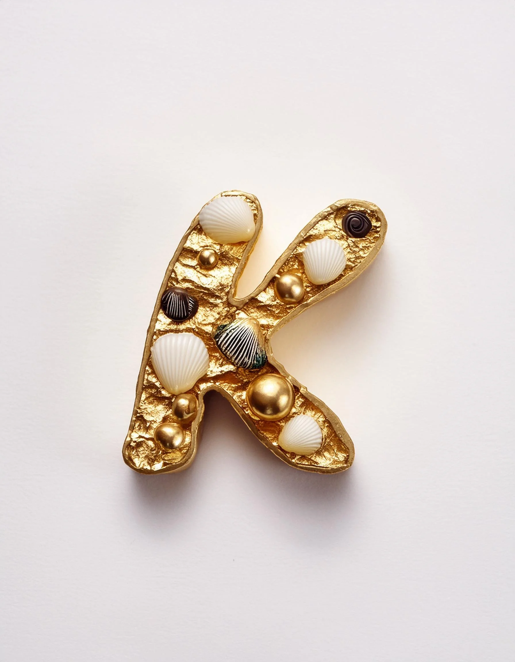


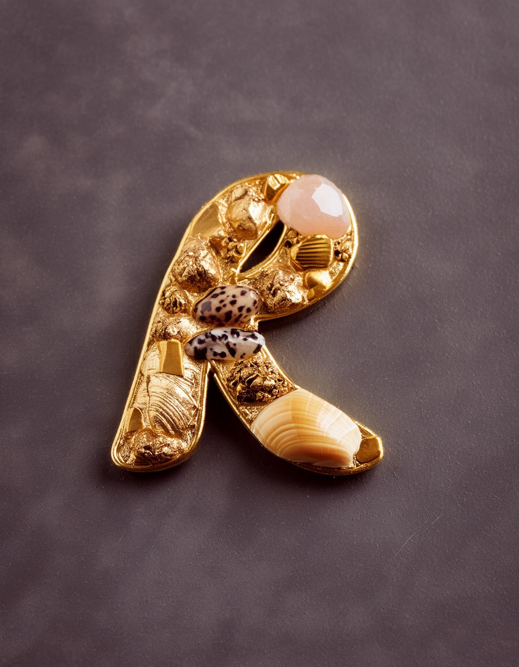
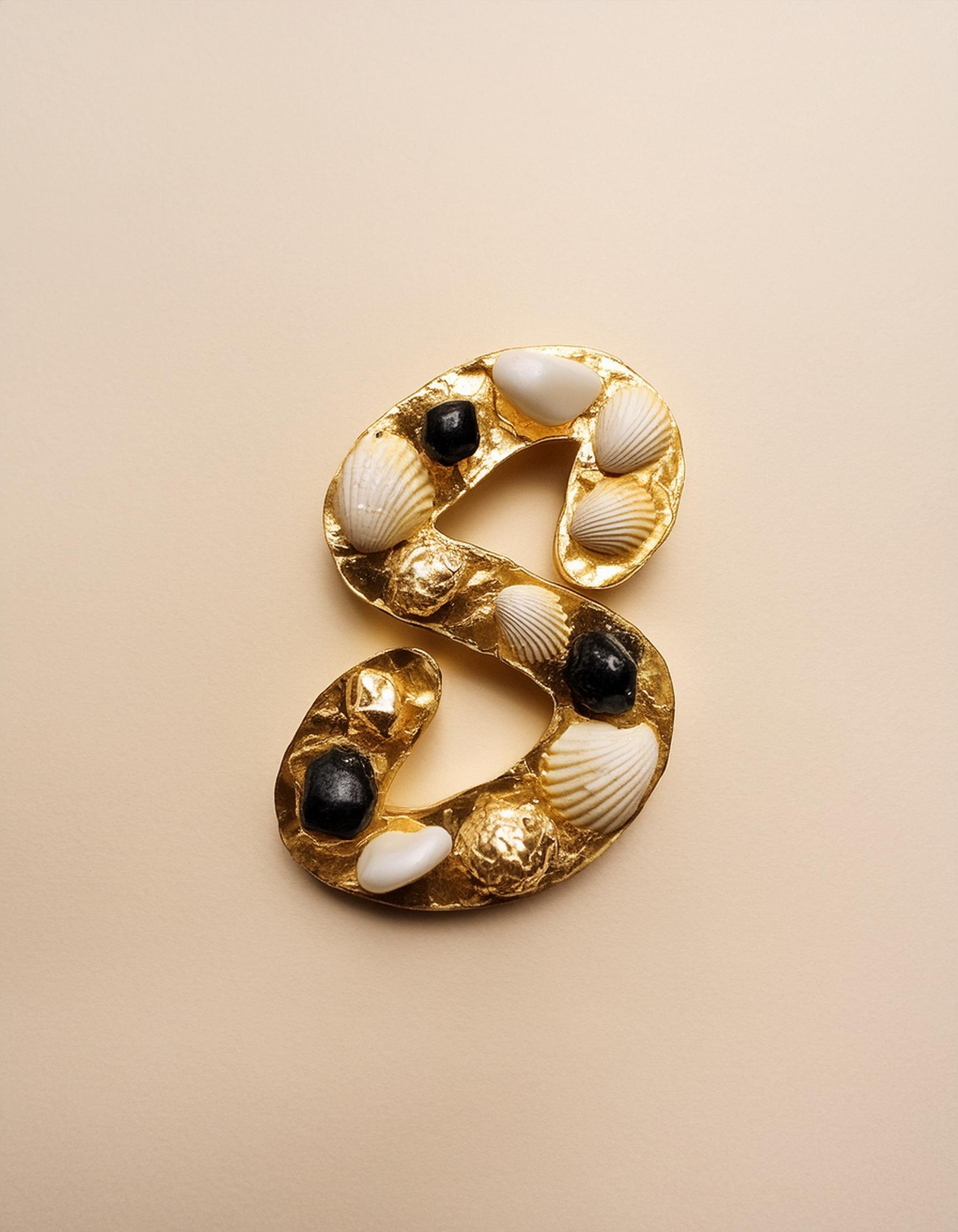


A through Z Series
Co-created with AI
A personal experiment in materiality and type. I designed a custom letterform and then pushed it through a photorealistic lens, wrapping each character in gold, precious stones, and organic texture until the alphabet became something closer to an artifact. The series lives at the intersection of type design and editorial art direction, and was built to function across luxury packaging, poster work, and editorial contexts.
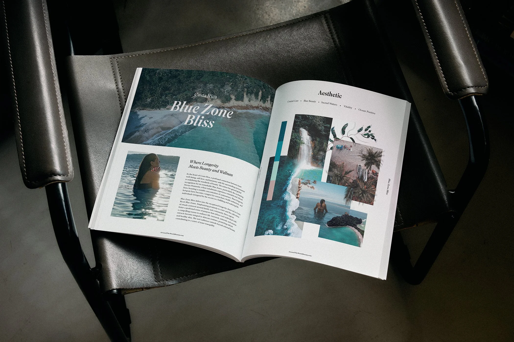
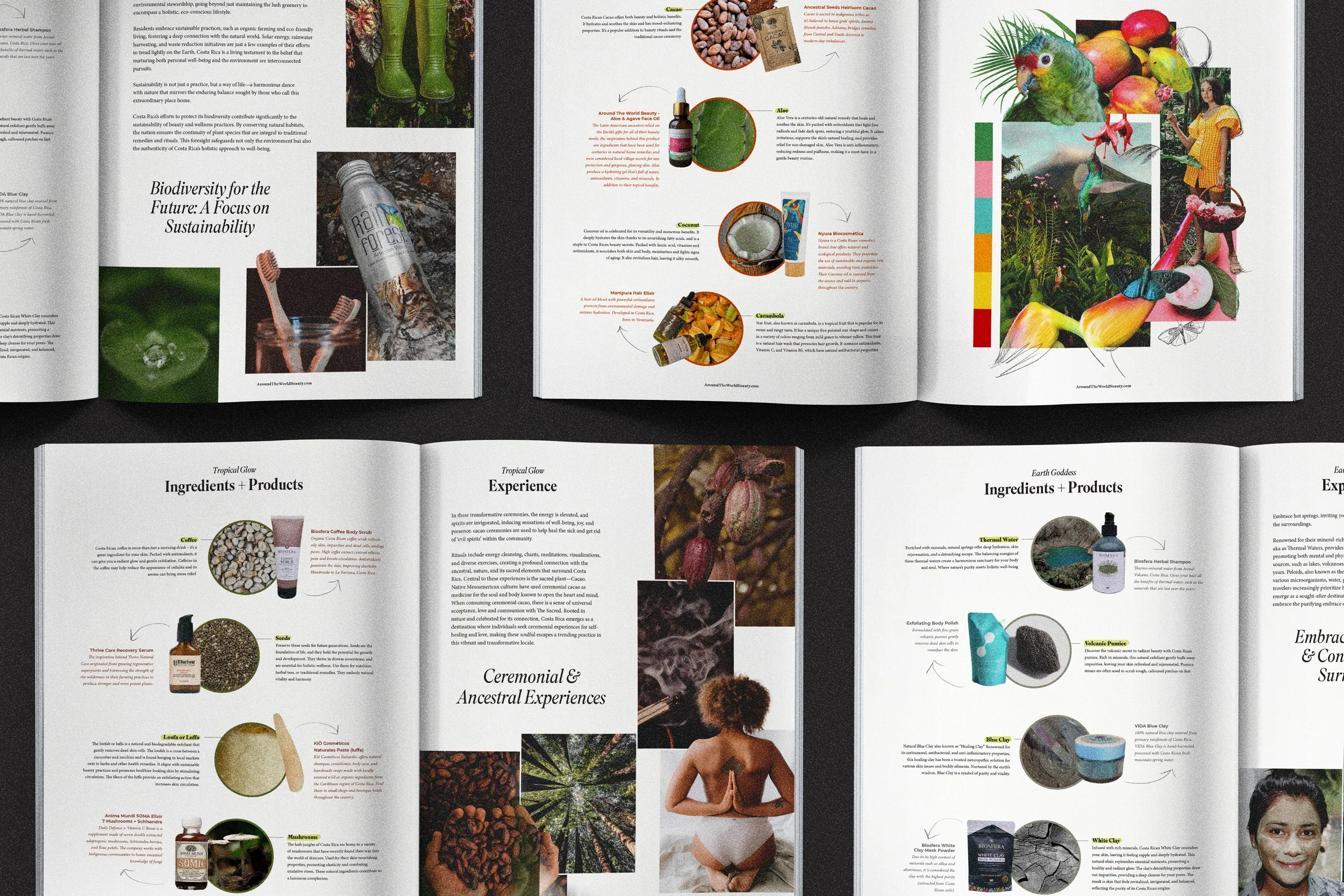


Around The World Beauty
A Conscious Beauty & Wellness Community
Around The World Beauty needed a city guide that felt less like a marketing document and more like something you'd actually want to read on a flight. The brief was editorial, something that would sit naturally alongside their existing brand while standing on its own as a visual object. I developed a modular layout system with interchangeable content structures, built to move between digital and print without losing the thread.